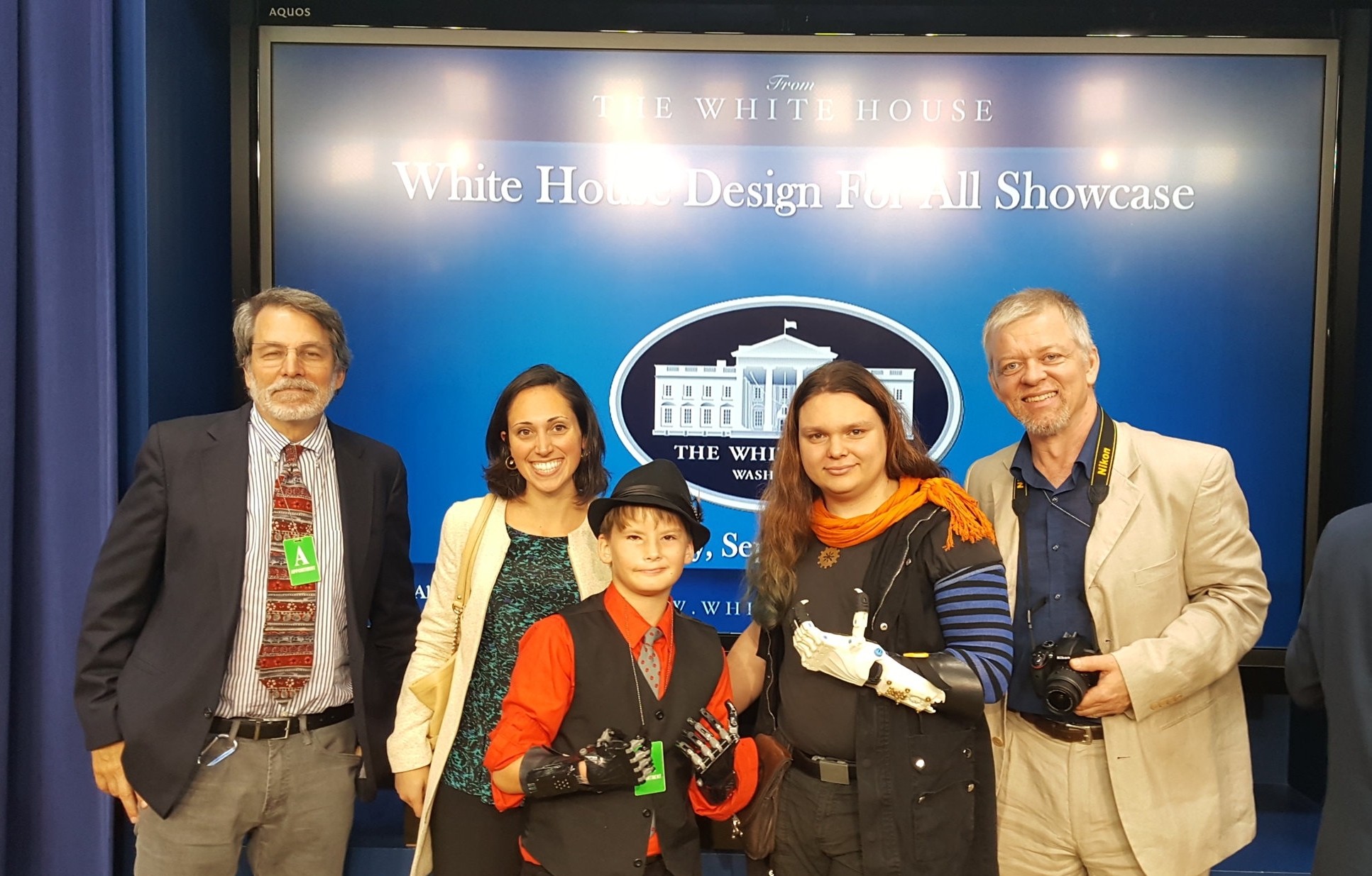
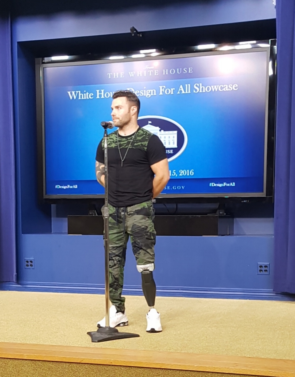
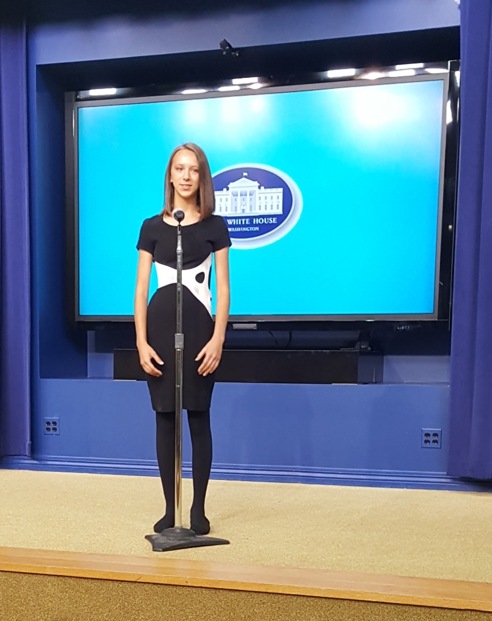
Last week, I had the incredible honor of attending an event at the White House about inclusive design.
Stepping into the room, I wasn’t sure what I was walking into. It was a good-looking room of people - a really good-looking group! - with the broadest range of abilities I’ve seen in one place. Some were dressed professionally, while others looked hip enough to put any Mission hipster to shame. The thing that stood out to me in that room was how everyone there was proud in their own bodies, and truly authentic in how they embraced that.
“It’s not about looking ‘normal,’ it’s about looking good.”
One of the first folks I met was Karin, who has a blog where she posts at least one selfie per day. She explained to me how, being a plus-size woman in a wheelchair, she does not exactly fit the profile of what people consider to be beautiful. Being in a wheelchair, people often stare. Karin is using the selfie to embrace those stares, and to take control of how the world sees her by posting photos where she feels good about how she looks.
Design for the marginalized and make it available for the mainstream.
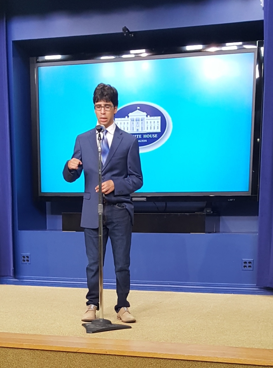
The event started with a panel consisting of Tobie Hatfield, Nike’s Senior Director of Innovation, Matthew Waltzer, a student who has been giving Tobie user feedback, and Kathy Woods, Founder of Kathy D. Woods Design. Pradeep Sharma, Provost of RISD, was the moderator. The conversation was largely around the design work that Nike has been doing. They have been designing for Matthew. Their intent is not to develop a specific product for a marginalized demographic such as his - rather, they recognize that modifications that benefit Matthew will make their product more user-friendly for the general population. This is a theme that has come up for us a lot lately: how can we make our environments and products easier for everyone to use? If products and environments shift to be easier and more inclusive, what impact could this have on how we see and understand disability?
“It starts with listening.”
User-centered design was pervasive throughout this event. We’ve seen this look one of two ways - each of which has its own benefits. The first is for the designer to consult with and get feedback from the user, and that input informs the next iteration of the design. There are a number of ways to get this input (e.g. observation, conversation, survey), and the conscientious designer understands the issue on a deep enough level to address it at its roots.
In the other approach, designer and user are the same. Rather than the designer learning the needs, the user learns to design. Not only is the user developing a powerful life (and potentially professional) skill, but - especially in the case of a differently-abled population - this challenges the dynamic of the “helper” and the “helped.” Besides, that user knows her needs better than anyone ever will, and can continue to design her own solutions as they evolve. Kathy on the panel was an exceptional example of this. She is a little person, developing a sleek clothing line that is flattering for little people.
KIDmob’s design ethos and our call to Designers
For any group we work with, regardless of age or ability, we prefer a hybrid of these two approaches to user-centered design, where user = designer and has the support of a design professional through the process. As designers, it can be tough to put our ideas and egos to the side to create space for others, but there is an immense amount to gain if we do: a different understanding of the challenge, that individual’s unique creativity and perspective, and their “beginner’s mind” when it comes to design. As we’ve seen in our work, true collaboration like this - where the user is truly driving the design - offers incredible potential for unexpected insight and solutions.
